SS14:Formatting
Wait, What?
you're probably wondering what this page is for, or what "formatting" even means. Well, in short, this page contains different strings of boiler-plate wiki "code" for you to easily copy/paste into your articles without going through the hassle of writing them yourself, as well as instructions for more advanced formatting.
Creating a new page
Before we begin writing a page, we need to actually make one first. To do this, simply log into the wiki using your SS14 account, and type something in the search bar that doesn't have a page named after it. If you do, something like this should appear:
If you'd like to begin a new page with that name, simply click the red text, and presto! You've just make a new wiki page. Now, we can finally get to writing it.
Headings
If you've read to this point, you've already read through 3 separate headings. Headings are simply ways of categorizing different sections of an article, and will appear on a list near the top of the page like so:
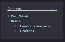
This list is created automatically, and orders the headings by the order they appear on the page; headings that appear near the top of the page will be the first on the list, and vice versa. There are 5 different "levels" of heading, each meant to convey a certain amount of specificity in a topic. For instance, the R&D page contains a level 1 "Equipment" heading, with several level 2 headings below it displaying the specific tools science has access to.
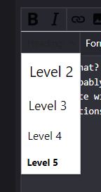

There are two ways to write a heading. The first is by using the wiki-integrated heading tool, which will give you a header with example text inside it. The other way is to do it manually. Both methods will have you end up with something like this:

Different levels of heading require different amounts of equals signs. A level 1 heading has two on each side, a level 2 heading has 3, and so on. Make sure to put a space between the signs and your text!
Images
Visual aids are a good tool for any kind of presentation, but for a wiki article, they're practically a necessity. The SS14 wiki then, fortunately, has an easy tool for inserting images into your page.
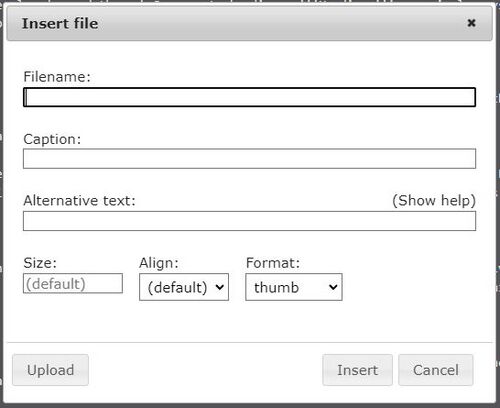
By selecting this tool, a window should pop up like this:
In the first box, you'll want to write the name of the image file you'd like to use, plus whatever the file type is. As an example, writing wrench.png would call on the wrench image file. After that, you can enter a caption (this only works on "thumb" type images) if you'd like. "Alternate text" isn't too important right now. The last three boxes, size, alignment, and format are arguably the most important for making sure the image actually looks how you want it.
Image Formatting
- Size is simple - just enter a number and the image will change size. Larger numbers mean a larger image, but be careful - make it too large, and the image might appear low-quality or compressed. Some of the images you've seen on this article share the same problem, for reference.
- Alignment just changes where your image will appear on the page. "center" aligns it with the center, "right" with the right, and so on.
- Format is very important and will change the way in which the image is prsented.
Thumb images will appear like so. Thumb files will always be aligned to the right of the page and cannot be realigned or resized in any way.

Frame images will appear similar to thumb images, but can be realigned. They still cannot be resized.

Frameless and None images are arguably the most versatile, and the cleanest. they display the image without any border, and can be aligned freely. The main difference between the two types is that "frameless" images cannot be resized, while "none" images can.
These last two types can be positioned in ways other than alignment. Placing the file directly after a word or sentence on the same line will cause it to appear directly next to the text, like with the two examples above. If you don't want this to happen, put at least one line of space between the text and the file. For example, writing something like this:
(Your Text Here)
[[File:Wrench.png]]
...Will make it appear like this on the page:
(Your Text Here)
Tables/Lists/Graphs
These go by many names, but the official name is a Table. They appear as such:
| Image | Name | Description |
|---|---|---|
 |
Wrench | A tool for anchoring objects to the floor. |
 |
Crowbar | A tool for prying things open. |
 |
Multitool | A tool for interacting with electronics. |
Though tables can be used as graphs, you'll most commonly see them used to list things out. The wiki also has an integrated tool for creating these.

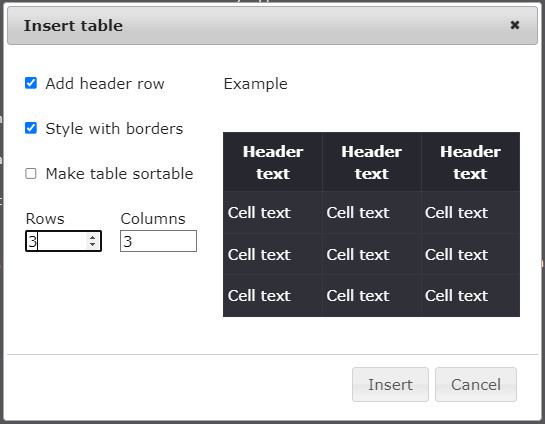
Checking off the "Sortable" box allows viewers to sort through the table alphabetically/numerically, like so:
| Image | Name | Description |
|---|---|---|
 |
Wrench | A tool for anchoring objects to the floor. |
 |
Crowbar | A tool for prying things open. |
 |
Multitool | A tool for interacting with electronics. |
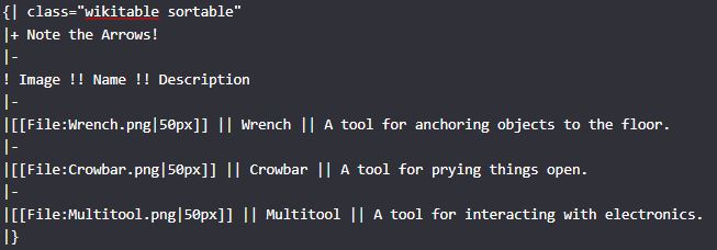
Seems simple enough right? Until you get into the guts, in which case it looks like this:
I know, it looks weird, but it's still actually quite simple. See where it says ! Image !! Name !! Description? That's just the wiki's way of showing the headings of the table. You can pretty easily see how everything else falls into place - writing |- separates the graph with a line, writing |} ends the table, and so on.


